
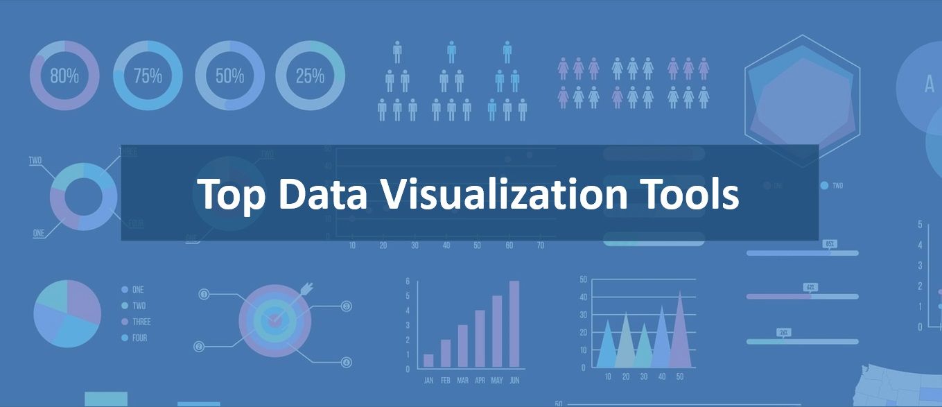
Let's learn about Data Visualization via these 228 free blog posts. They are ordered by HackerNoon reader engagement data. Visit the Learn Repo or LearnRepo.com to find the most read blog posts about any technology.
When your data can't be explained by plain words.
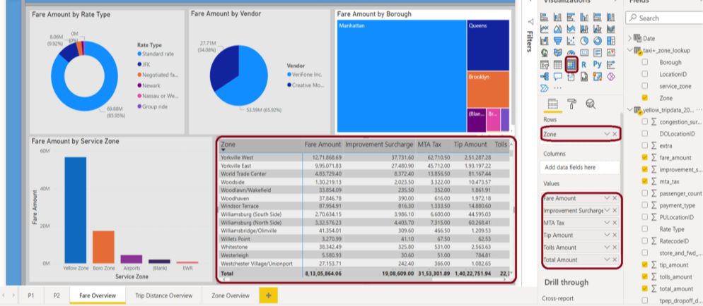
1. 13 Best Datasets for Power BI Practice
 In 2022, Gartner named Microsoft Power BI the Business Intelligence and Analytics Platforms leader. These are the 13 Best Datasets for Power BI Practice.
2. 14 Best Tableau Datasets for Practicing Data Visualization
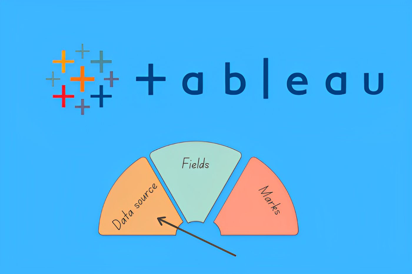 This article focuses on the 14 Best Tableau Datasets for Practicing Data Visualization, which is essential for business analysts and data scientists.
3. The Top 16 Types of Charts in Data Visualization That You'll Use
 In the era of information explosion, more and more data piles up. However, these dense data are unfocused and less readable. So we need data visualization to help data to be easily understood and accepted. By contrast, visualization is more intuitive and meaningful, and it is very important to use appropriate charts to visualize data.
4. 10 Best Datasets for Time Series Analysis
 In order to understand how a certain metric varies over time and to predict future values, we will look at the 10 Best Datasets for Time Series Analysis.
5. 10 Data Table Libraries for JavaScript
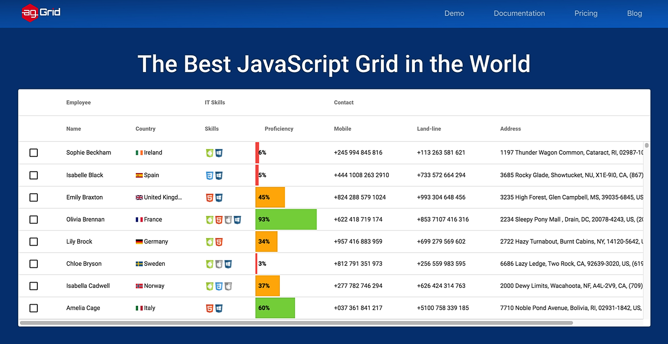 Tables are a useful tool for visualizing, organizing and processing data in JavaScript. To start using them, you need to download a free library or one for a reasonable price. Here is a list of 10 useful, functional, and reliable JS libraries that will help you work with tables.
6. Power BI: Two ways to Union Tables - DAX and Power Query
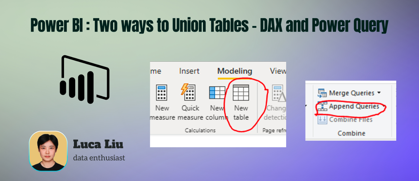 Combining data from multiple tables is a common requirement in Power BI. There are two primary methods to achieve this task.
7. Mastering the Craft of Transforming Data into Engaging Visual Narratives in User Interfaces
 As data volumes grow, mastering the art of translating data into captivating visual narratives becomes even more important.
8. How to Build a Data-Driven Product Using Metabase
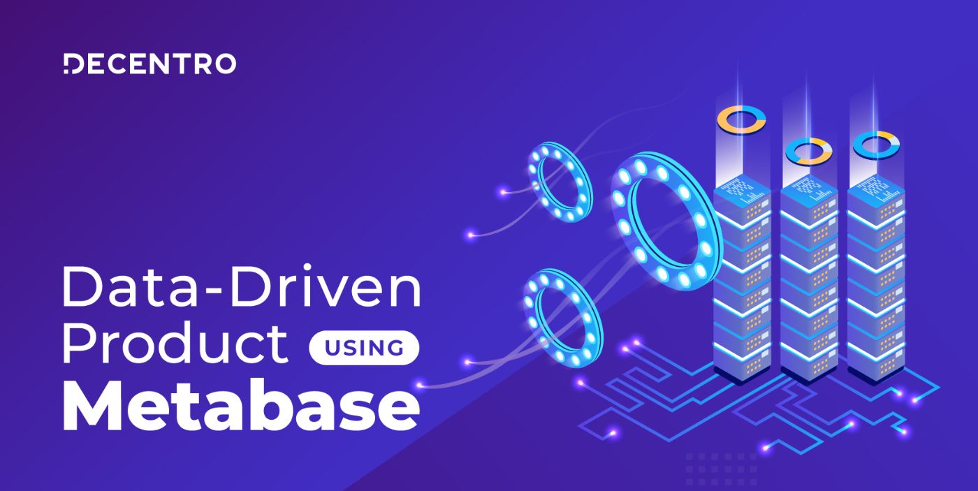 Metabase is a business intelligence tool that lets you access your data in a read-only manner.
9. Assessing Your Organization's Customer Data Maturity
 Investing in customer data is a top priority for marketing leaders.
10. Top 10 JavaScript Charting Libraries for Every Data Visualization Need
 There're numerous JavaScript charting libraries. To make your life easier, I decided to share my picks. Check out the best JS libraries for creating web charts!
11. Understanding Embedded Analytics: Definition, Benefits, and Use Cases
 Learn about crucial features, requirements, and the decision-making process for selecting the ideal embedded analytics solution for your software.
12. How Custom Data Models Drive Next-Generation Embedded Analytics
 Learn how custom data models drive impactful embedded analytics within SaaS applications and deliver custom experiences for users and providers alike.
13. Pornhub Growth Hack During Coronavirus Pandemic
 The 2019–20 coronavirus pandemic is an ongoing pandemic of coronavirus disease 2019 (COVID-19), caused by severe acute respiratory syndrome coronavirus 2 (SARS-CoV-2). The outbreak was first identified in Wuhan, Hubei, China, in December 2019, and was recognized as a pandemic by the World Health Organization (WHO) on 11 March 2020.
14. Building An Airbnb-Like Map in Next.js
 We will be building a proof of concept to create customer Google Maps markers using any React component in a Next.js project using AirBnB as an example
15. How to Create a Responsive Table with HTMX and Django
 A guide on how to create a responsive table inside your web applications using both Django and htmx to create such a system to process your website's data.
16. Building A Machine Learning Model With PySpark [A Step-by-Step Guide]
 Spark is the name of the engine to realize cluster computing while PySpark is the Python's library to use Spark.
17. Top 7 JavaScript Pivot Widgets in 2022
 Pivot Charts are useful tools that can be relied on to visualise huge amounts of data. These 7 JavaScript Pivot Widgets are some of the best ways to use them.
18. How to Make Beautiful, Easy-to-read Charts with React Native Gifted Charts
 The most complete library for Bar, Line, Area, Pie, and Donut charts in React Native. Allows 2D, 3D, gradient, animations and live data updates.
19. Animating Line Charts With D3.js
 Chart animations, which will make your application shine.
20. Integrating Apache Druid and Apache Superset with MinIO
 Prepare to be amazed at how quickly you can build a high-performance analytics and visualization stack with open source products.
21. 12 Mistakes that Data Scientists Make and How to Avoid Them
 Data analytics can transform how businesses operate. With companies having tons of data today , data analytics can help companies deliver valuable products and services to customers.
22. Top 10 Best Pivoting Components for Developers
 I tested the ten most popular pivot solutions and wrote an honest opinion on every single one.
23. Creating a Simple Diagram by Using Elkjs and React Flow
 In this article, we will look at the process of building a diagram with the help of Elkjs and React Flow libraries.
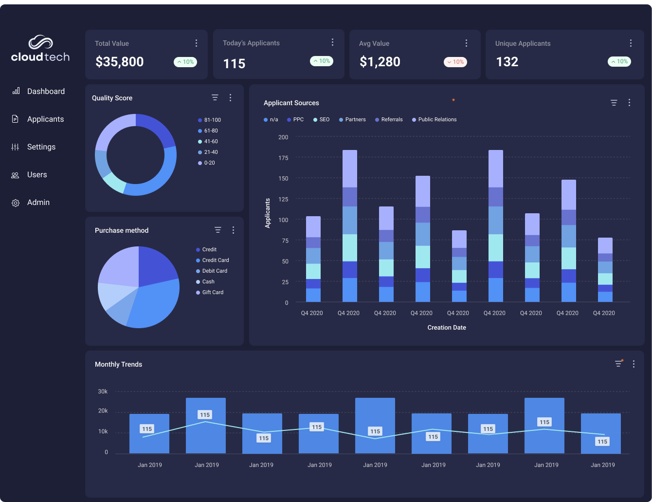
24. How to Create a Simple Web Dashboard for Efficient Data Analytics
 Dashboard with different visualizations allows you to compare data and show changes and tendencies. In this tutorial I wil explain why and how to build one.
25. MongoDB: Exploring Data Visualization Tools and Techniques
 Looking for MongoDB data visualization tool? There are plenty of options but firstly its better to explore what kinds of solutions there are on the market.
26. Must-Know Base Tips for Feature Engineering With Time Series Data
 Master key time series feature engineering techniques to enhance predictive models in finance, healthcare & more with our comprehensive guide.
27. 10 Best React Native Chart Libraries
 Representing statistical data in plain text or paragraphs, tables are pretty boring in my opinion. What about you?
28. 8 Best Human Behaviour Datasets for Machine Learning
 Human behaviour describes how people interact and in this article, we will look at the 8 Best Human Behaviour Datasets for Machine Learning.
29. Power BI: How to Create Dynamic Show Hide Slicer Panel
 Learn how to optimize space in Power BI dashboards with a dynamic slicer panel. Enhance usability and streamline data exploration!
30. How to Visualize Bias and Variance
 In the process of building a Machine Learning model, there is a trade-off between bias and variance.
31. Designing a Website for Data
 It’s complex to create the right design when the only visuals you have are based on data. Here’s how we did it.
32. The Best Way to Visualize Someone's Credit History
 This is the best way to innovate credit history visualization for fintech applications.
33. The Power of Data Visualization for Tech Companies. Is Your Strategy Up to Par?
 Discover how data visualization transforms raw data into actionable insights for tech companies, driving better decisions and competitive advantage.
34. Top 8 Best Qlik Sense Extensions
 Qlik Sense is powerful data visualization and BI software. But sometimes its functions are not enough. Meet the best Qlik Sense extensions to do more with data!
35. The Best Data Visualizations for Grabbing Readers’ Attention

36. The Power of Universal Semantic Layers: Insights from Cube Co-founder Artyom Keydunov
 What is a universal semantic layer, and how is it different from a semantic layer? Is there actual semantics involved? Who uses that, how, and what for?
37. How To Blend Data in Google Data Studio For Better Data Analysis
 Google Data Studio helps us understand the meaning behind data, enabling us to build beautiful visualizations and dashboards that transform data into stories.
38. Building Engaging Real-Time Data Visualizations In React With Highcharts
 Learn to create real-time charts in React with Highcharts and WebSocket. Includes setup guide, code examples, and GitHub repo for quick experimentation.
39. Efficient Data Storage for Rapid Analysis and Visualization
 In this article, I want to share one of the ways that big data can be stored and used for analysis.
40. Heatmap Visualization With Deck.gl
 Heatmaps are a very popular type of geo data visualization that are commonly used to display large amounts of location-based data.
41. Analyzing Twitter Conversations with the New Twitter V2 API
 Getting actionable insights around a topic using the new Twitter API v2 endpoint
42. What it Means to be a Creative Coder
 Programmers rarely agree on whether or not coding is a creative profession. My interest in coding always stemmed from what I could create with the code. Seeing an interesting visual result from my efforts is usually the most satisfying part. Most programmers are less concerned with how their app looks and more concerned with the functionality. Usually, as long as the app works the way it is supposed to, most programmers are satisfied.
43. Python Web Development with Reflex: Creating Dynamic Graphs Easily
 Create beautiful interactive graphs for web apps in pure Python
44. An Internal Email to Tim Cook and the State of Business Intelligence
 We get a glimpse into the inner workings of a valuable company and it turns out it's not all sunshine and rainbows.
45. Creating Stunning 3D Charts With Highcharts And React.
 Unlock the power of data storytelling with Highcharts & React, crafting vibrant 3D visualizations for dynamic web apps.
46. Data Visualization Using Chart.js and Gatsby
 Data visualization helps you transform your unorganized data in an organized and valuable way that conveys the right message to your audience without words.
47. Creating an Interactive Word Tree Chart with JavaScript
 Learn how to create beautiful interactive JavaScript Word Trees and check out an awesome Word Tree chart visualizing the text of The Little Prince.
48. Creating Composite Node of a Graph using D3.js
 Lately I have been using D3 for visualizing data for a React project and it got my attention for a while. I was especially interested as to the scope of this very powerful tool that has a great problem solving ability range related to any kind of data visualization.
49. A Guide For Data Quality Monitoring with Amazon Deequ
 Monitor data quality with Amazon Deequ, InfluxDB, and Grafana in a Dockerized environment using Scala/Java and Apache Spark.
50. Anscombe’s Quartet And Importance of Data Visualization
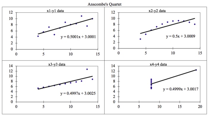 Anscombe’s quartet comprises four data sets that have nearly identical simple descriptive statistics, yet have very different distributions and appear very different when graphed.
— Wikipedia
Anscombe’s quartet comprises four data sets that have nearly identical simple descriptive statistics, yet have very different distributions and appear very different when graphed.
— Wikipedia
51. How to Improve Your Data Literacy Skills
 Are you data literate? In today's data-driven world, data literacy is a crucial skill. Here's how you can develop it for yourself.
52. How to Create a Bubble Map with JavaScript to Visualize Election Results
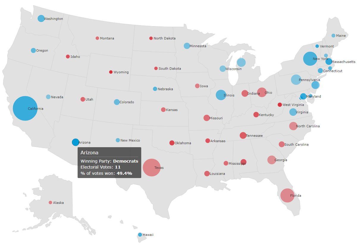 A beginner level tutorial to get started with data visualization by creating an interesting and intuitive JavaScript bubble map
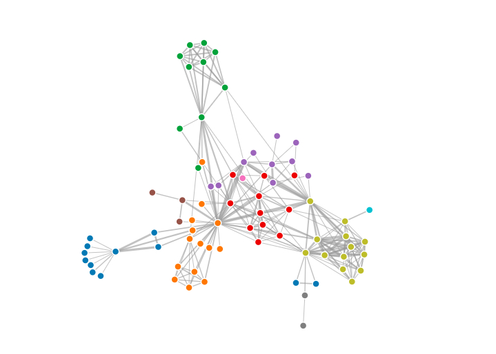
53. Analysis of Network Graphs: Visualizing Hamilton Characters as a Social Network
 Discover how graph theory and data science techniques unlock new insights into character relationships in literature, from Game of Thrones to Hamilton.
54. Canvas And React: A Simple Guide To Data Charts
 The power of canvas. Make your data visualizations flexible and performant.
55. The Simplest Way to do Exploratory Data Analysis(EDA) using Python Code
 EDA for Data Analysis or Data Visualization is very important. It gives a brief summary and main characteristics of data. According to a survey, Data Scientist uses their most of time to perform EDA tasks.
56. A Step By Step Guide To Data Visualization With Power BI
 Power BI is the collective name for an assortment of cloud-based apps and services that help organizations collate, manage and analyze data from various sources
57. Google Analytics Heartbeat Data Visualization
 An experiment in real-time data visualization
58. Creating Isometric Diagrams with SVG
 Looking to build interactive isometric diagrams? Here's a method to create and implement them using the open source library JointJS.
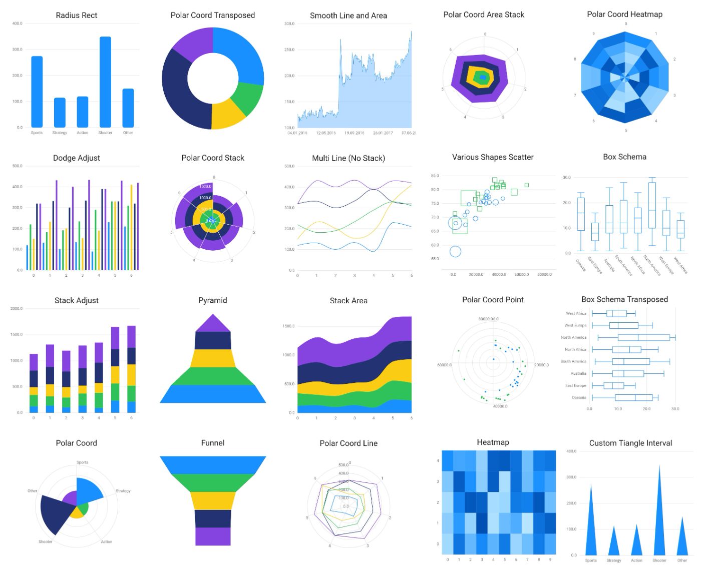
59. React Native ECharts VS Victory Native VS React Native Chart Kit: Which Solution is Better?
 In this article, we will compare three popular chart libraries in the React Native community: React Native ECharts, Victory Native, and React Native Chart Kit.
60. How to Use Data Science to Find the Best Seat in the Cinema (Part I)
 From the most popular seats to the most popular viewing times, we wanted to find out more about the movie trends in Singapore . So we created PopcornData — a website to get a glimpse of Singapore’s Movie trends — by scraping data, finding interesting insights, and visualizing them.
61. How to Build a Bar Chart Race on COVID-19 Cases in 5 Minutes
 Using the new Tableau version 2020.1 onwards.
62. 7 Open Source Projects Every Data Scientist/Analyst Needs to Bookmark 🚀
 Check out these 7 amazing open source projects that every data scientist /analyst should know about. These tools can make your life so much easier.
63. Data Dashboards: Visualizing Metrics with n8n 📈
 I use information from all over the internet. I visit hundreds of new web pages every day, both for personal and professional projects. It’s part of the process, and I’m happy to do it.
64. Harnessing Scalable Vector Graphics (SVG) for Effective Data Visualization
 Learn About SVG for Data Visualization, to make Complex Information Clear and Beautiful.
65. A JavaScript Infographic: Data Science Salaries in 2022
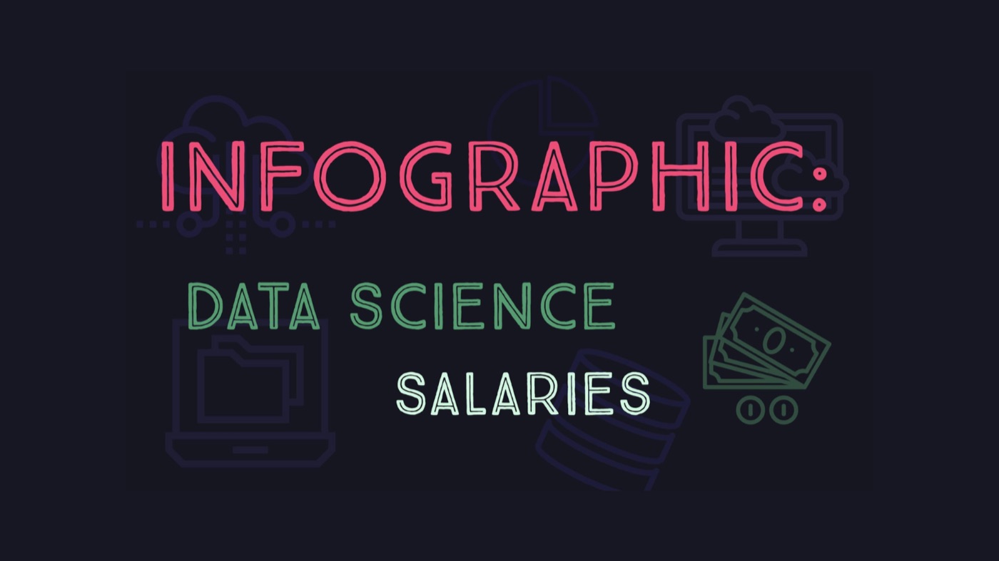 Data visualisation infographic with insights on salary level of data scientists - how to create the JavaScript dashboard and analyse its data
66. Mapping the Internet: A Visualization of the Web
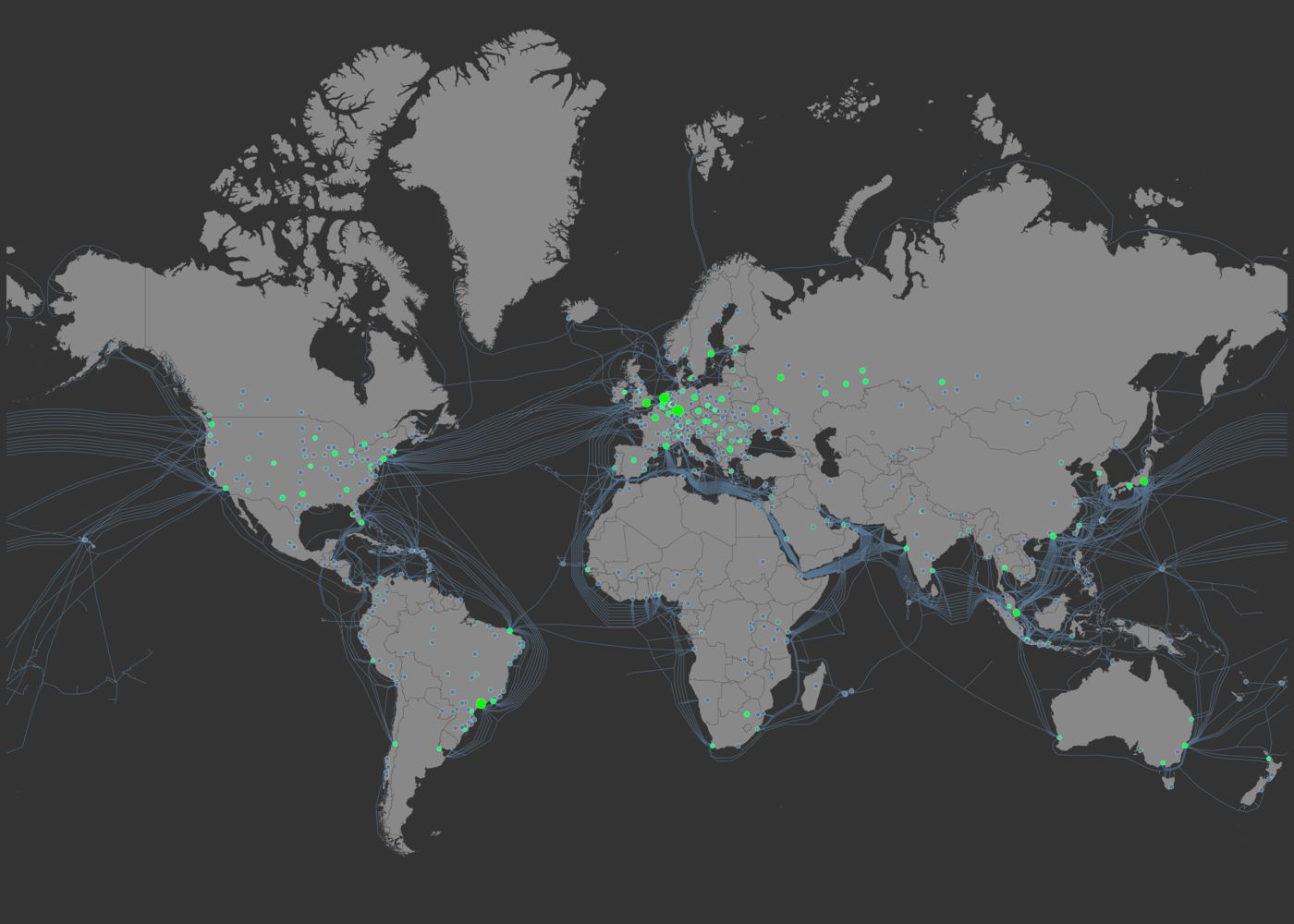 Journey into the depths of the Internet with this incredible map showcasing undersea cables and internet exchanges.
67. HDTree: A Customizable and Interactable Decision Tree Written in Python
 Introducing a customizable and interactable Decision Tree-Framework written in Python
68. How to Use Different Data Visualizations in the Grafana Dashboard
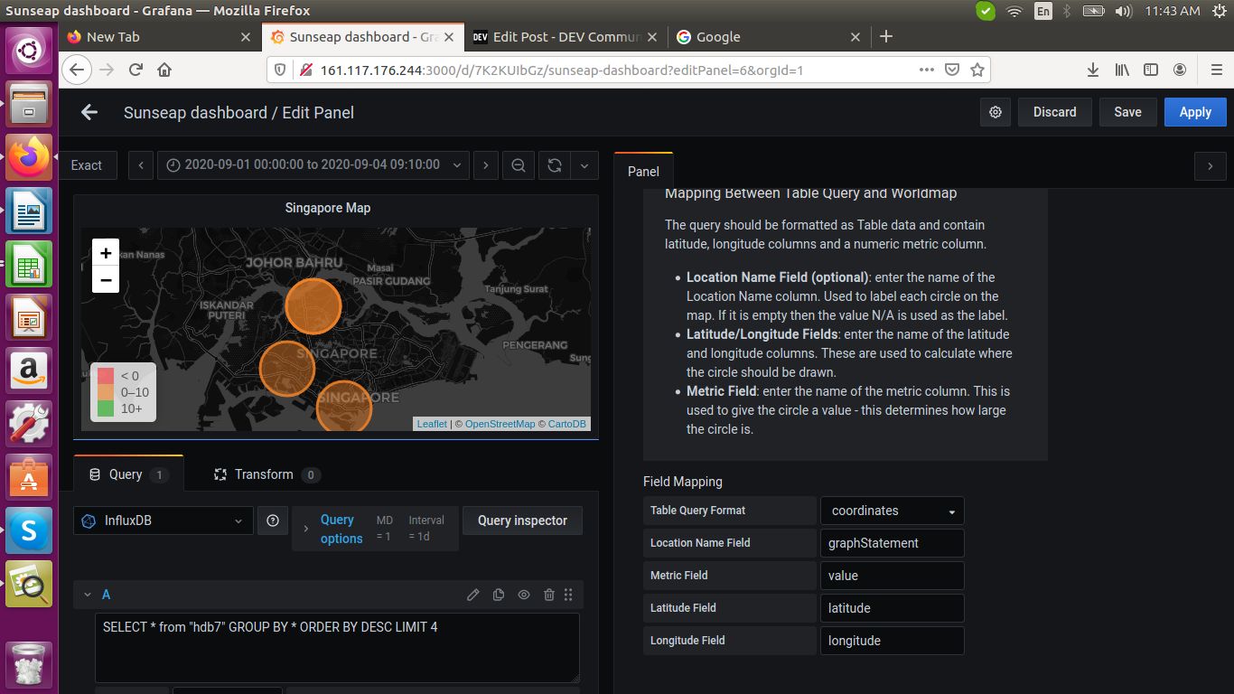 In this post, we will see how to use different visualizations, like the simple graph, pie chart, world map panel in the grafana dashboard by writing queries in Influx query language
69. Four Types of Array Data-Based Bar Charts in Python
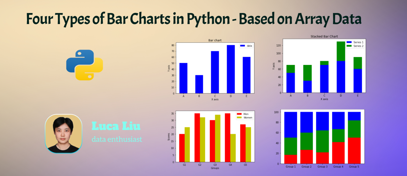 Explore Python's Matplotlib library with examples of various types of bar charts for insightful data visualization.
70. Why visualizations in Health don’t work
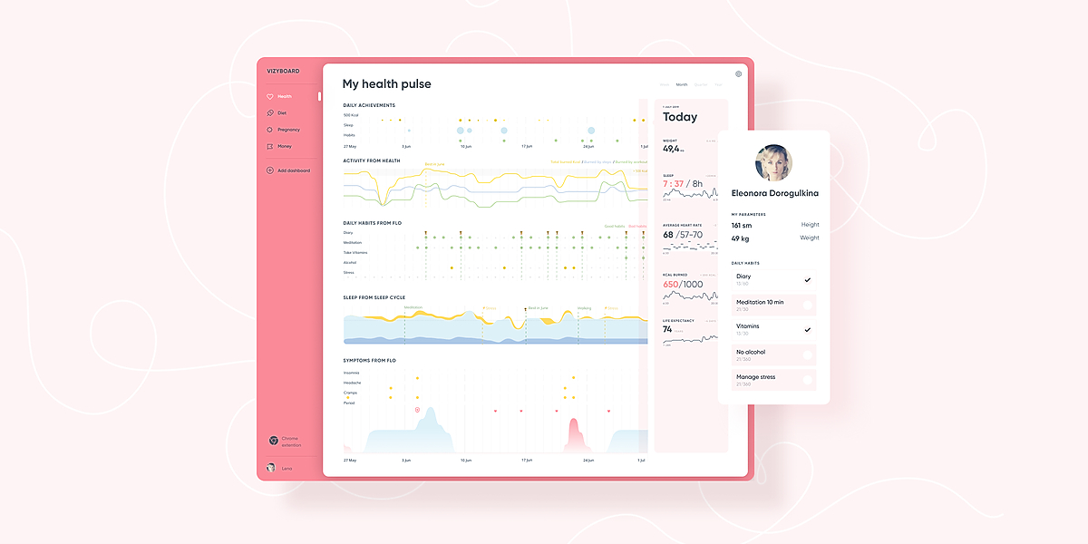 Visualizations in the most favorite health apps don’t have enough comparing and exploring possibilities.
71. Building a Point Map in JavaScript
 Master creating interactive point maps in JavaScript! Step-by-step guide using millionaire counts for global cities for illustration. Dive in now!
72. I Used Python To Analyze My Peloton Workout Stats With Real-Time Updates
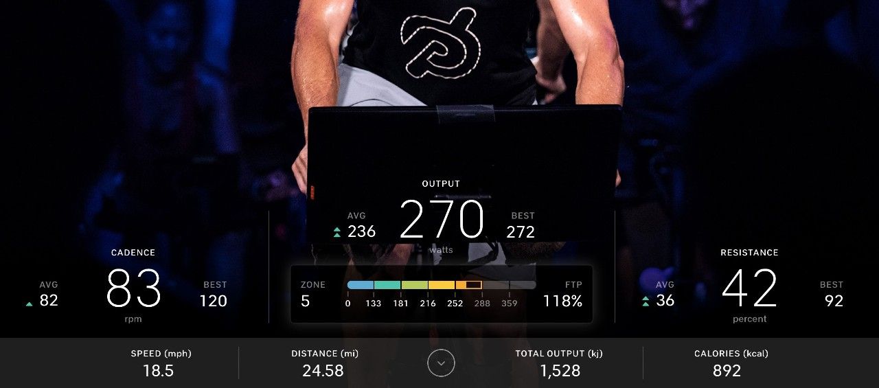 A tutorial on how you can sync and analyze your Peloton workout stats into Coda with custom dashboards. Sync with a Google Apps Script or serverless function on
73. Implementing Dashboards Using Google Charts.
 Implementing charts without coding.
74. How I Analyzed One Million Voter Records in Manhattan
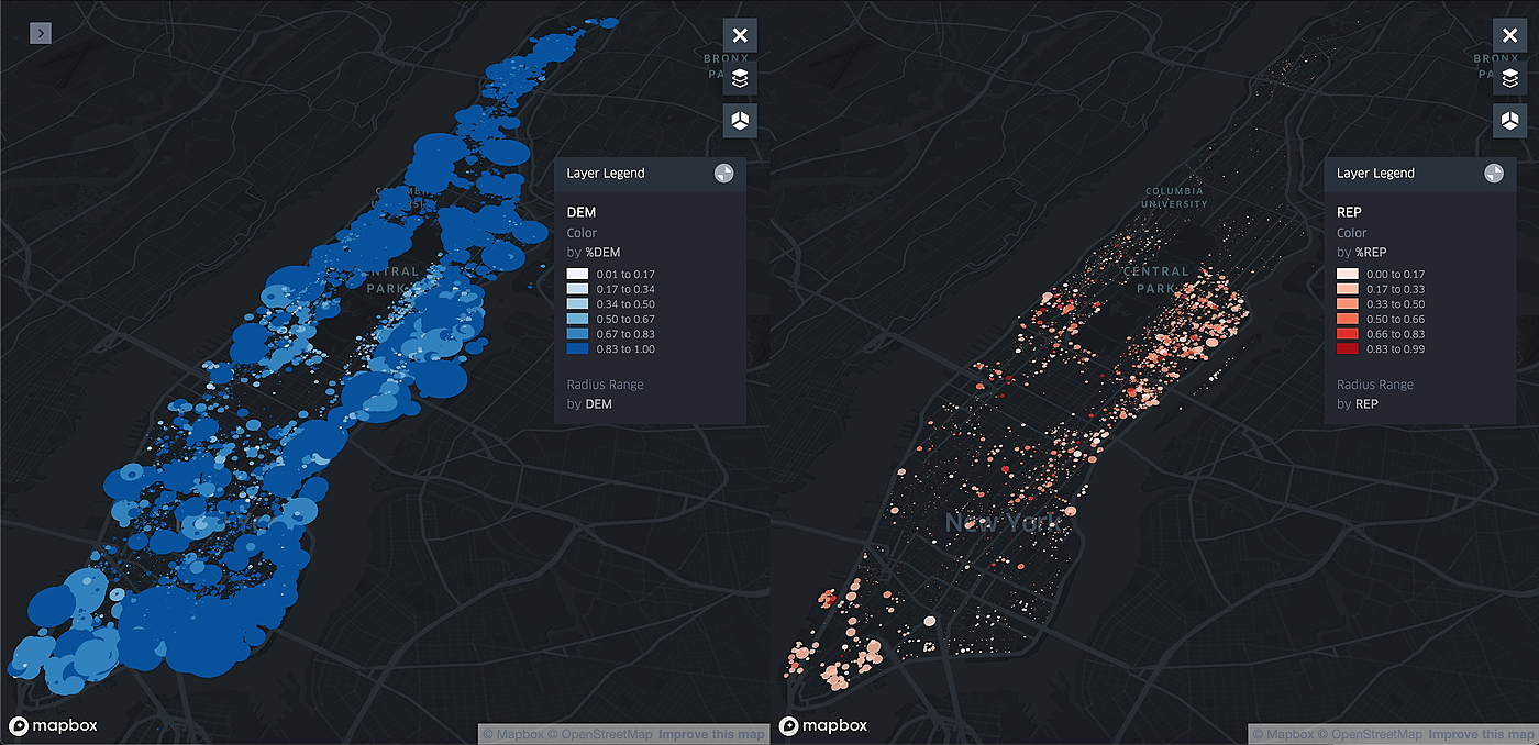 What if you could instantly visualize the political affiliation of an entire city, down to every single apartment and human registered to vote? Somewhat surprisingly, the City of New York made this a reality in early 2019, when the NYC Board of Elections decided to release 4.6 million voter records online, as reported by the New York Times. These records included full name, home address, political affiliation, and whether you have registered in the past 2 years. The reason according to this article was:
75. Easier Charting in React Native Using Apache ECharts — the Solution You Have Been Looking for
 We have developed an open-source graphics library for react native APP, which is based on Apache ECharts and uses RNSVG or RNSkia for rendering.
76. Visualizing Healthcare Budget using Web Scraping in Python

77. Transforming Data into Insight: A Beginner’s Guide Using Microsoft Excel
 In this guide, I'll take you through a simple, three-step process - Prepare, Analyze, Consider.
78. Deep Dive Into Open Source BI Tool Helical Insight
 When Helical Insight first announced a couple of years ago that they were releasing an Open Source Business Intelligence (BI) tool, it really caught my interest and I reached out to founder Nikhilesh Tiwari to find out more about what he was doing. I spent a little time with the product and really liked where it was going and was determined to do more of a deep dive in the future, and with their release of version 3.0, that time is now.
79. Easy Data Visualization with AutoViz [Maybe Just a Quick One]
 Easy data visualization with AutoViz.
80. Power BI and Fintech: A Match Made In Heaven To Optimise Banking Operations
 Technology keeps evolving, and the incorporation of technology helps businesses of varying types to make profits and meet customer needs better.
81. Top 3 Free JavaScript Libraries for Data Visualization
 I've compared the top 3 free Javascript libraries for data visualization - D3, Chartjs, or ECharts.
82. How To Become A Data Scientist: Skills & Courses To Learn Data Science
 The necessary skills to build a Data Scientist’s profile are business intelligence, statistical knowledge, technical skills, data structure, and more.
83. Future of Marketing: How Data Science Predicts Consumer Behavior
 Gradually, as the post-pandemic phase arrived, one thing that helped marketers predict their consumer behavior was Data Science.
84. Make Data-Driven Decisions With Power BI Consulting & Implementation
 Power BI offers a solution for businesses that need to manage large volumes of data. It's designed to help with even the heaviest data flows business have.
85. Why Professions Are Adding Analytics to Their Skillsets
 There are many different forms of data analytics, and these have different applications in business.
86. How We Use dbt (Client) In Our Data Team
 Here is not really an article, but more some notes about how we use dbt in our team.
87. We Built a Modern Data Stack for Startups
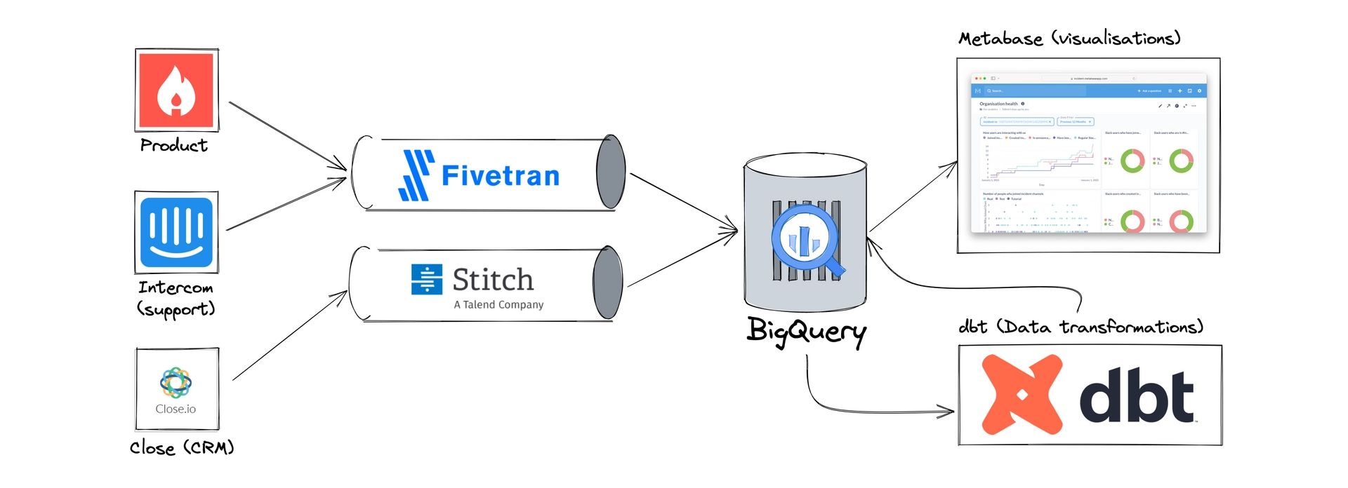 Here's how we built our data stack at incident.io. If you're a company that cares about data access for all, follow this guide and we guarantee great results.
88. Revolutionizing Data with React Native ECharts 1.1: Now More Interactive!
 We are excited to release a stable version of React Native ECharts 1.1.
89. A Guide to Building Interactive Charts in Flutter
 The Flutter charting library Graphic has a well-designed interaction system for various interactive charts.
90. Creativity in Data Analytics is About More than Data Visualization
 I recently attended a networking event where I spoke to a range of graduates who were looking at prospective careers in the data science and adjacent spaces.
91. How to Improve the Table - Content Design Techniques to Simplify Data Reading and Speed Up Work
 I want to show you how to improve the tables by designing the content and information in the cells. How to simplify the reading of data and speed up work
92. Five Trending React Visualization Libraries
 While working on Cube.js, we’re seeing a lot of different visualization libraries. Given that Cube.js provides an API layer for analytics on top of an SQL database and doesn’t play on the visualization field, any charting library can be used to build dashboards with it. That’s why we’re always on a search for a nice and developer-friendly visualization library.
93. Drag, Drop, and Dominate: The Best Pivot Table Libraries for Web Apps
 Explore the top JavaScript pivot table and OLAP tools and their notable features for your applications in this review of leading options.
94. Big Data Analysis for the Clueless and the Curious
 Big data analytics has been a hot topic for quite some time now. But what exactly is it? Find out here.
95. Looking Into the Impact of AR and VR in the Finance Industry
 Learn all about the most recent advances in the usage of augmented reality and virtual reality in the finance sphere with this comprehensive overview.
96. Best Types of Data Visualization
 Learning about best data visualisation tools may be the first step in utilising data analytics to your advantage and the benefit of your company
97. Introducing Reactive Echarts Flutter Widget For Your Application
 Introducing the development work of a reactive Echarts Flutter Widget:
98. How to Create Bullseye Charts with JS: COVID-19 Vaccine Pipeline
 Bullseye charts are widely used in drug pipeline & clinical trials data analysis. Learn how to create one in JavaScript and explore the COVID vaccines by phase.
99. How to use Python Seaborn for Exploratory Data Analysis

100. Getting Started with Data Visualization: Building a JavaScript Scatter Plot Module
 Scatter plots are a great way to visualize data. Data is represented as points on a Cartesian plane where the x and y coordinate of each point represents a variable. These charts let you investigate the relationship between two variables, detect outliers in the data set as well as detect trends. They are one of the most commonly used data visualization techniques and are a must have for your data visualization arsenal!
101. Tips for Displaying Frontend Numbers in a Friendly Manner
 How do you smoothly display numbers in frontend? In this article, we summarized some practical principles, introduced a tool library - Number Display, and analyzed it's source code.
102. Convert Formatted Text Into a Data Structure Using Parsing
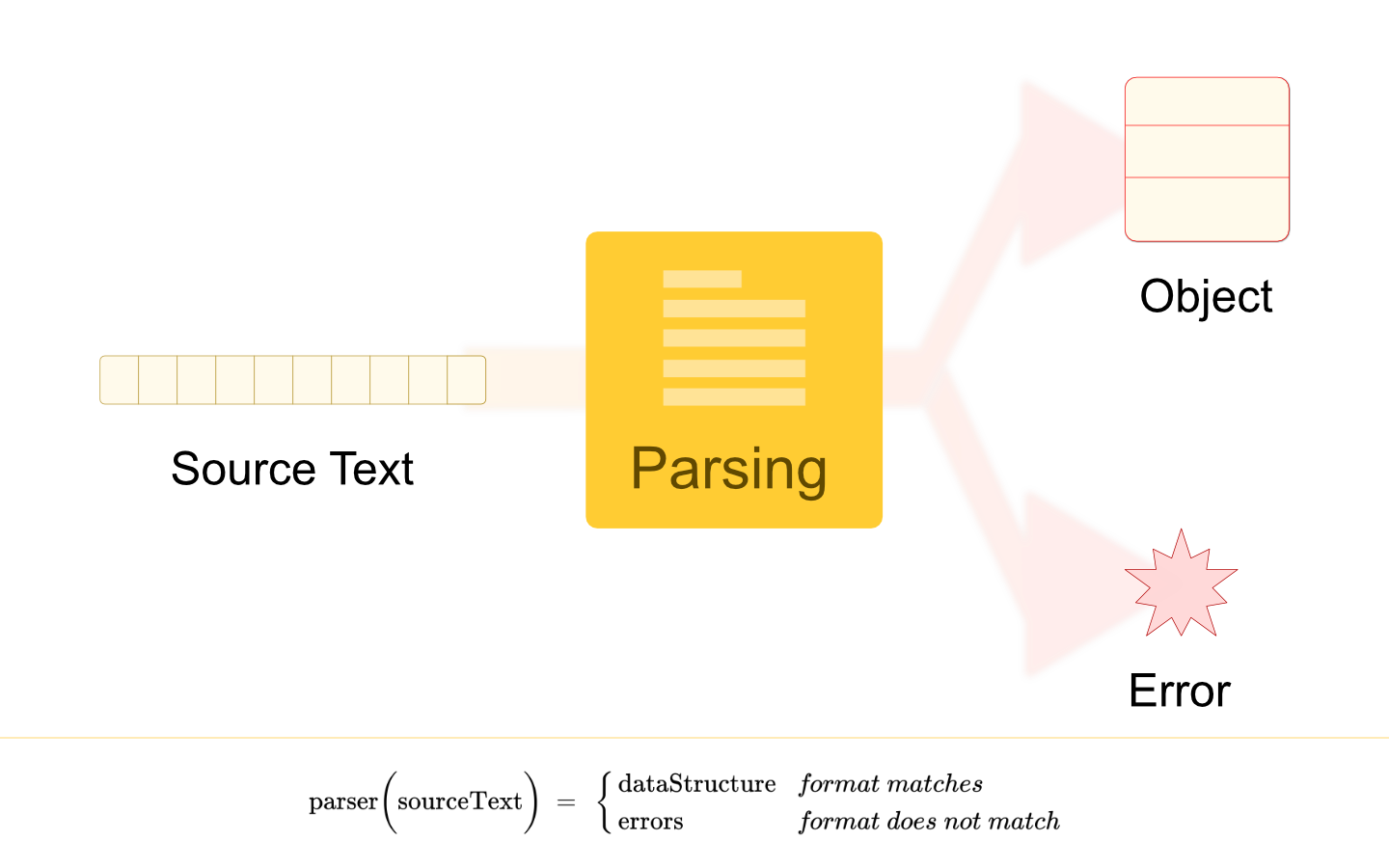 Parsing is a process of converting formatted text into a data structure. A data structure type can be any suitable representation of the information engraved in the source text.
103. Data Science From Scratch

104. React 18's Concurrent Rendering for Stress Testing: A 3D Rendering Case Study
 A deep dive into React 18's concurrent features and stress test it using 3D data visualization built with three.js.
105. How to Build a Data Dashboard Using Airbyte and Streamlit
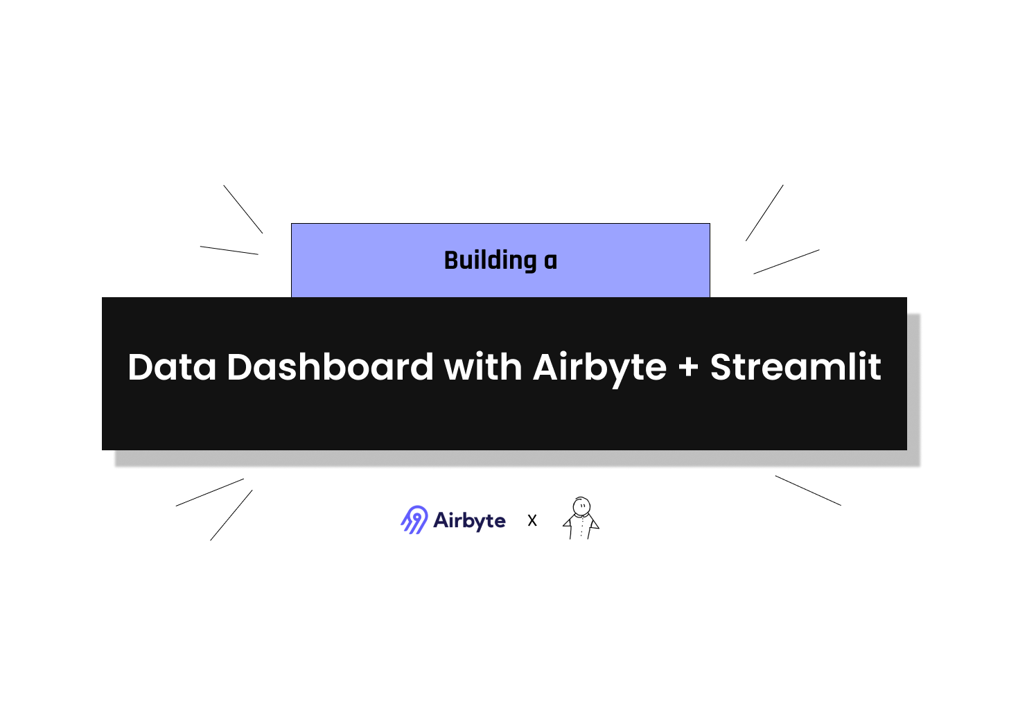 In this tutorial, we built a real-time data dashboard using Airbyte and Streamlit, in Python programming language.
106. How to Extract Insights From Your Data
 Manage data using the HarperDB database. Access your data from HarperDB using Custom Function. Automate EDA with data from the harperDB database using sweetviz.
107. The Grammar of Graphics
 This work displays the flexibility and diversity of the Grammar of Graphics, and also shows beginners the basic concepts of the Grammar of Graphics.
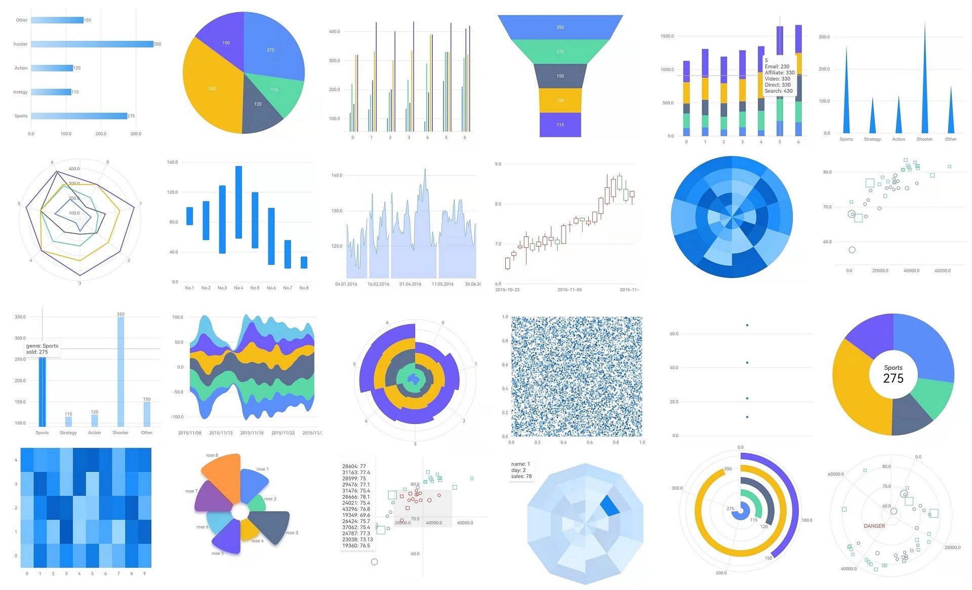
108. 5 Data Visualization Widgets for Modern JavaScirpt Libraries
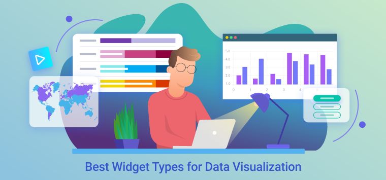 Data Visualisation is an incredibly important part of conveying information in the world. Getting the best widget types for Data Visualisation is a part of that
109. Embed Github Gists in your Hacker Noon Stories
 The Hacker Noon editor now supports embedding Github gists.
110. Adjust Your Market Risk Wisely With This Awesome Python and Google Sheets Rotation Dashboard

111. Graphing Likes and Comments on Instagram Posts to See the Trends Visually
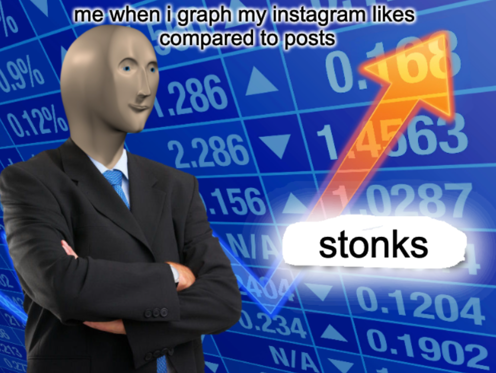 Turning Instagram into data: A fun journey to collect and graph likes and comments using network requests and Python for an ego-boosting data analysis.
112. Six Ways For Effective Data Visualization With Tableau
 Tableau
113. Tailor Your Data Visualization Design Choices for Key Stakeholders to Create Organizational Buy-In
![]() A guide to effective deployment of data visualizations in organisations for maximum business value. Adapted from Data Principles To Practice Volume II
A guide to effective deployment of data visualizations in organisations for maximum business value. Adapted from Data Principles To Practice Volume II
114. Data Science With R Programming — Coding Interview Questions
 R is a tool used for data management, storage, and analysis in the field of data science. It has applications in statistical analysis and modeling.
115. 7 Data Analysis Steps You Should Know
 To analyze data adequately requires practical knowledge of the different forms of data analysis.
116. Python + SNMP = Real-Time NAS Disk Temperature Monitor!🌡️ Learn How I Did It
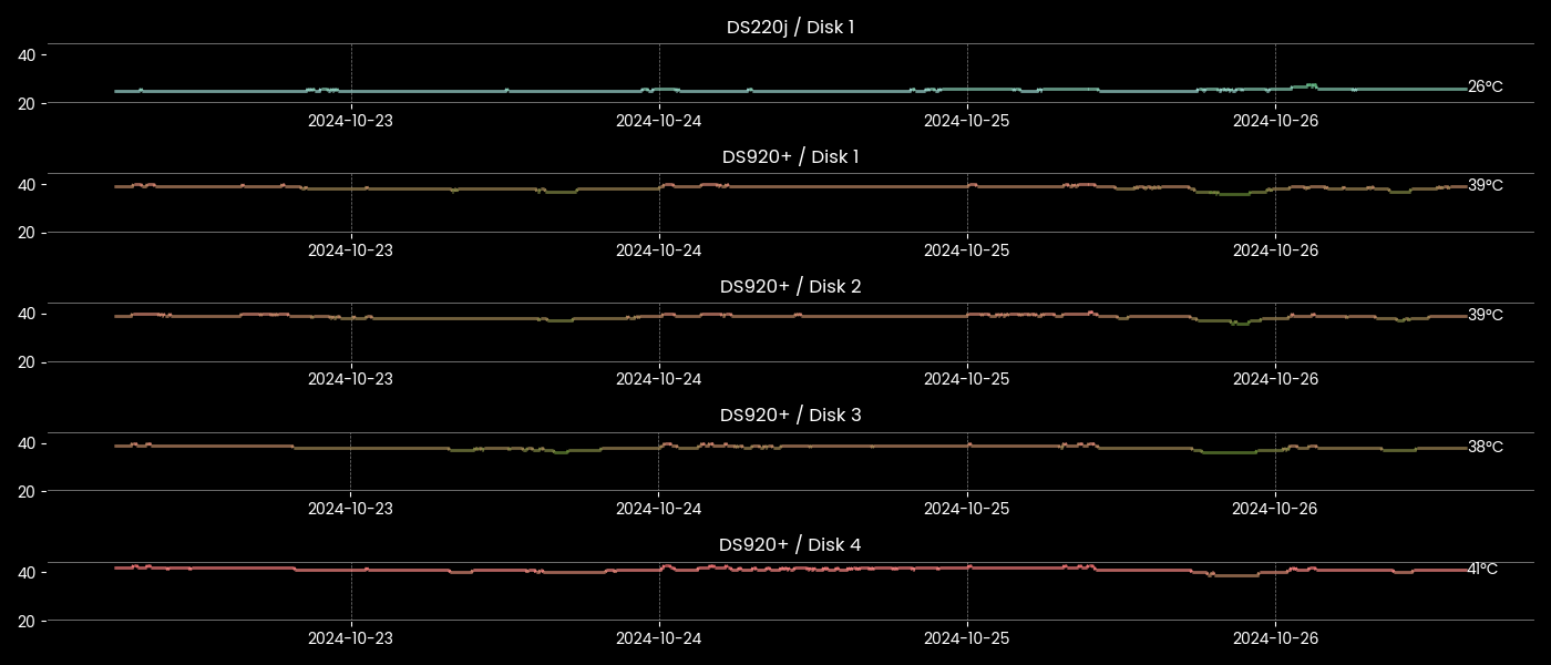 Python script to gather Temperature from (Synology) NAS HDDs via SNMP protocol and display them in an awesome graph with Matplotlib library.
117. Nobel Laureates by Country - Or Creating a Tag Cloud With JavaScript
 Explore all Nobel Prize winners by country through an interactive tag cloud and learn how you can create your own JavaScript-based tag (word) clouds with ease.
118. I Gave 5 Teams the Same Dashboard - Only 1 Made a Decision With It
 Build for the decision, not the data. If you can't name the specific decision a dashboard is supposed to support, you're building a museum exhibit
119. 5 Best Data Visualization WordPress Plugins for Tables and Charts
 Find out the best 5 WordPress dynamic charts plugins for tables, graphs, and charts. Choose the best WP chart plugin for your site.
120. The Main Challenge is to Start Writing: Interview with Noonies Nominee Maksym Mostovyi
 A short story about the journey in front-end development
121. Getting Started With Python Bokeh: 25+ Data Visualization Examples With Source Code
 Discover dynamic data visualization with Python Bokeh, featuring interactive graphs and easy examples.
122. Rust DataFrame Alternatives to Polars: Meet Elusion v4.0.0
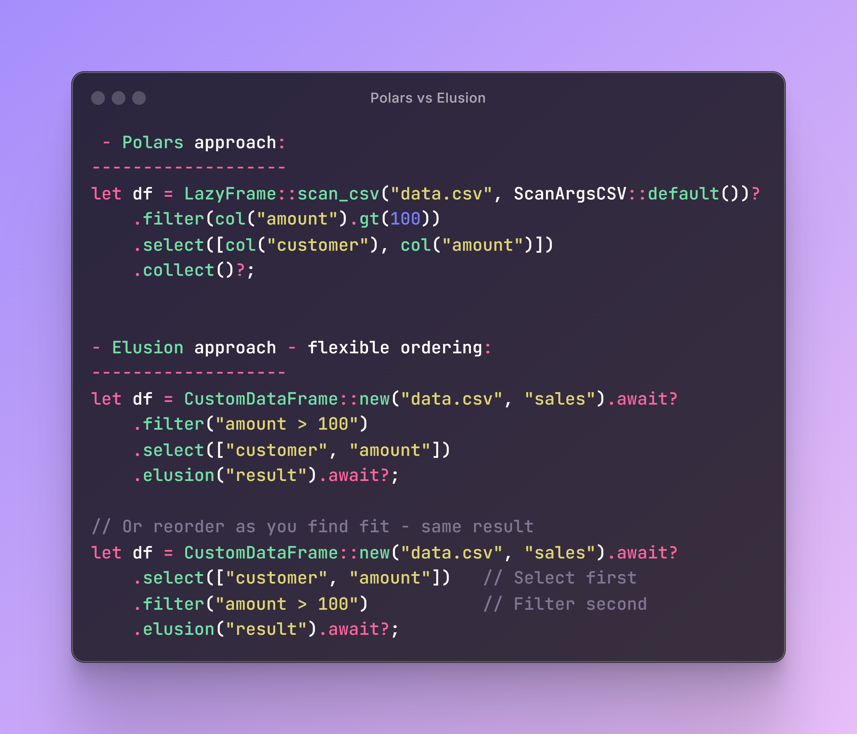 Elusion is a new contender that takes a fundamentally different approach to data engineering and analysis.
123. Are You Poisoning Your Data? Why You Should Be Aware of Data Poisoning
 As machine learning gains more prominence, these attacks may become more common. Here’s a closer look at data poisoning and what companies can do to prevent it.
124. What Are The Challenges of Monetizing and Selling Data?
 There have been great advancements in monetization opportunities in the last decade, but there are still challenges when it comes to generating big data analyti
125. Creating a Pareto Chart With JavaScript
 Welcome to this step-by-step tutorial that will empower you to create an interactive Pareto chart using JavaScript that will look nice on any device and in any browser!
126. DeFi Data and Visualizations To Understand It 1% More Than Others

127. Easily Integrate Embedded Analytics Into Your App
 How to create performant embedded analytics with Tableau and Cube that are tailored precisely for your users, and do so efficiently and securely.
128. ChartDB: Pioneering the Future of Database Visualization ✨
 ChartDB is an open-source tool transforming database design. Discover intuitive visualization, AI features, and seamless developer workflows.
129. The HackerNoon Newsletter: Vibe Coding - A New System of the World (3/9/2025)
 3/9/2025: Top 5 stories on the HackerNoon homepage!
130. Intro to Databases: Using Different Data Models and Representing Databases Visually
 As you get into the Databases and Data Science, the first thing that you have to master is the relations between entities in your database. That is important because the data that you use has to be absolutely efficient for its further implementations.
131. Top 6 Data Visualization Tools for 2022
 In this blog you will discover best data visualization tools to effectively analyze your datasets. Learn about the tools to create intuitive visualization.
132. Data Visualization for Dummies: 3 Simple Charts with <70 Lines of Code
 Make complex data easily digestible with these 3 simple charts.
133. 253 Stories To Learn About Data Analysis
 Learn everything you need to know about Data Analysis via these 253 free HackerNoon stories.
134. The HackerNoon Newsletter: Can Technology Help Us Calm Down Road Rage? (1/25/2025)
 1/25/2025: Top 5 stories on the HackerNoon homepage!
135. From Chaos to Order: Achieving Understanding of Algorithms Through Visualization
 Mastering algorithms through flutter development and data visualization.
136. Analyzing Montreal’s BIXI Ridership With Data And Visuals
 Been to Montreal? Have you heard of the term bixi? Well, this article will educate you about bixi ridership and the factors that affect it.
137. 6 Tips to Get More Value Out of Your Microsoft Power BI Dashboard & Reports
 By using Microsoft Power BI, you increase the efficiency of your company through its interactive insights and visual clues. Here are 6 tips for Power BI users.
138. How To Turn Data Into Actionable Insights For Business Growth
 In this guide, I'll share the most efficient techniques and tools to turn data into actionable insights that you can use to grow your business.
139. Visualizing The Data: Spotify Data for Favorite Artists Over Time
 How do your favorite artists change over time? This is the story of how I visualized my favorite artists from Spotify in a Plotly chart using Python.
140. The 12 Power BI Functions that I Used the Most in 2020
 If you want to learn how to build reports and dashboards in Power BI in 2021 then start with this list of 12 Power BI DAX functions that I used the most in 2020
141. Visualizing IoT Data with MQTT, QuestDB, and Grafana
 Time-series data is crucial for IoT device monitoring and data visualization in industries.
142. Enhancing Audit Processes With Advanced Analytical Tools
 Discover how advanced analytical tools streamline audit processes, boosting accuracy and efficiency for tech professionals.
143. 143 Stories To Learn About Data Visualization
 Learn everything you need to know about Data Visualization via these 143 free HackerNoon stories.
144. Vizzu: Open Source Library For Animated Data Visualizations and Data Stories
 How Vizzu, a new open-source library for animated data visualizations and data stories came to be and how it all works behind the scenes with sources.
145. Visualizing Real-Time Anomaly Detection with Python
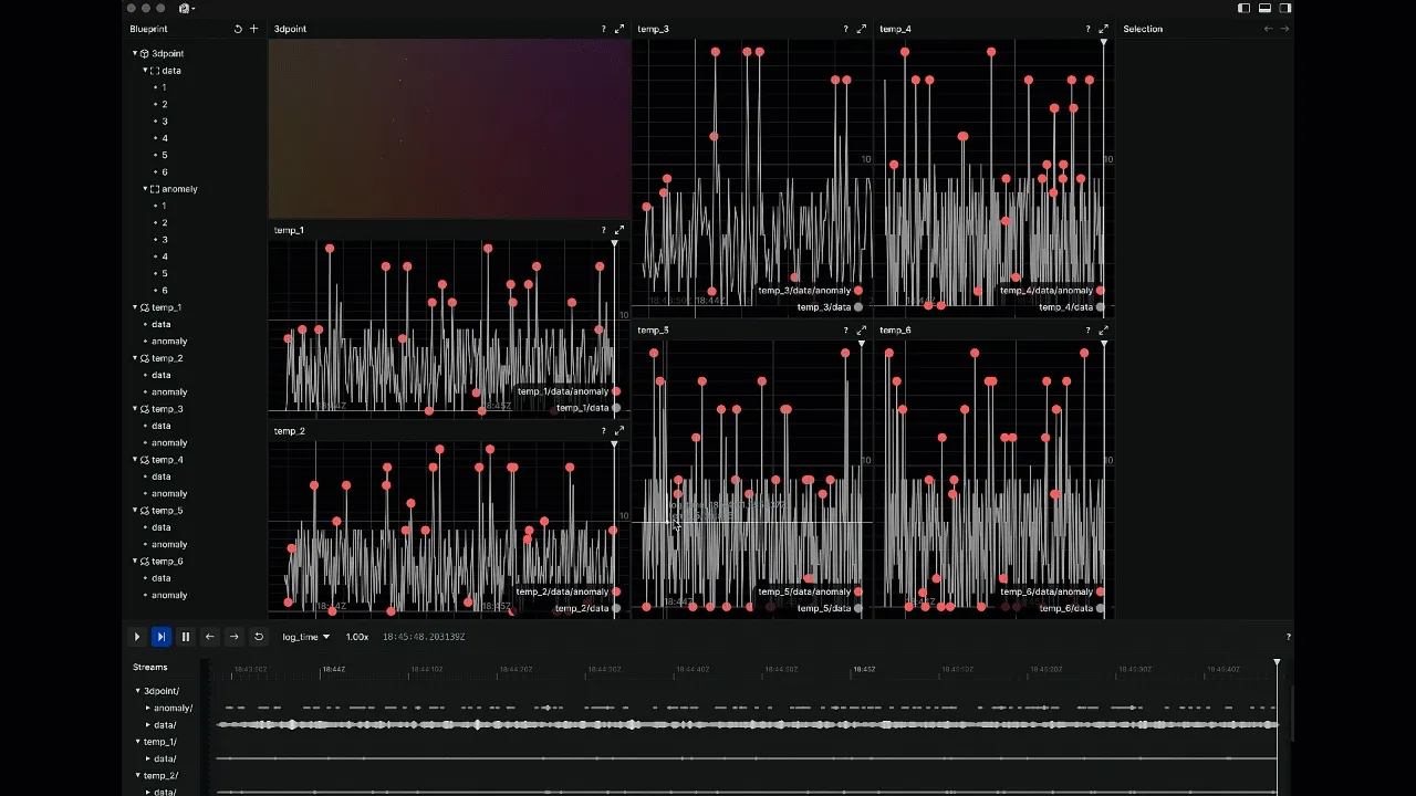 Rerun, combined with Bytewax, provides a powerful approach to visualizing streaming data in pure Python in real-time
146. Python Libraries For Data Science
 Top Data science libraries introduction of The Python programming language is assisting the developers in creating standalone PC games, mobiles, and other similar enterprise applications. Python has in excess of 1, 37,000 libraries which help in many ways. In this data-centric world, most consumers demand relevant information during their buying process. The companies also need data scientists for achieving deep insights by processing the big data.
147. Building a Graph-Based Lineage AI Tool with Python
 Data relationships are not linear, they are a network.
148. Interpretation of Visualizations of Soil Data and Weather APIs
 Learn how to visualize and interpret weather APIs and soil data in different graphs using python libraries, and Google Collab.
149. Create A Data Visualization Map Using Mapbox
 In this article, we make a map with a software called Mapbox in a few simple steps. This won't involve any coding at all!
150. 4 Ways Data Science Helps Streamline Business Operations
 Data Science has changed the way organizations collect, analyze, and process different types of information.
151. Skilled Workers Sound the Alarm as Immigration Reform Sparks Record Petition Response in UK
 Skilled workers across the UK are pushing back against proposed immigration reforms, as a petition opposing the changes hits 100,000 signatures in just two days
152. Building a Simple Spotify Trends Dashboard with React & Data Viz Libraries
 A small but useful project that demonstrates how to create a one-page data analytics app.
153. Five Simple Steps to Convert Dashboard Charts Into PDFs
 The article offers a concise guide on exporting dashboard charts to PDFs using jsPDF, demonstrating the process with clear examples and minimal code.
154. Graphing How Many Times People Liked my Posts on Instagram
 Visualising knowledge in a (somewhat) readable way, so you can flex on your friends and show your data collection skills.
155. How To Make a Twitter Graph with Slash GraphQL
 See how using Slash GraphQL and data from Twitter can provide graph visualization [link analysis] to identify unexpected nodes and links.
156. What Should You Do to Trust Event Data? Part 1 – Events Catalogue
 Struggling with messy event data in event-based analytics? See practical insights on organizing event definition data to make them work.
157. Conversational Analytics: the Next Generation of Data Analysis and Business Intelligence
 The article talks about how data analytics is evolving at workplaces from traditional querying , excel and dashboards to natural language conversations
158. Is Your Reporting Software WCAG Compliant? Make Data Accessible to Everyone with Practical Steps
 One billion peoplee xperience some form of disability. Like any other software, it should be equally accessible to user
159. Visualizing PostgreSQL Data With Angular To Analyze What Passengers Find Rude to Do During a Flight
 The article guides you through the process of creating an Angular reporting app with PostgreSQL, pivot grid, and chart visualization in the form of a dashboard.
160. Making a Music Visualization with P5JS
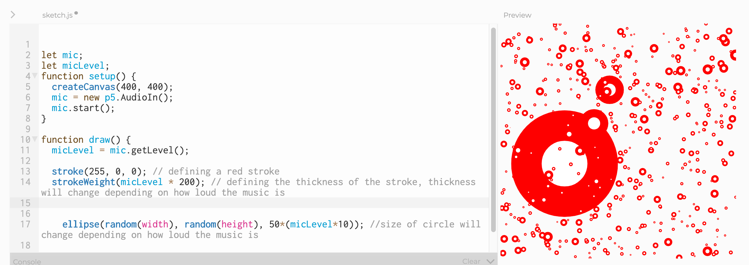 I had the immense pleasure of attending several creative coding workshops on April 4th. They were streamed live on the SpacyCloud Twitch channel. There were additional sessions involving Hydra, Raspberry Pi, Haskell, and more. However for this post I want to focus on the first session which was a P5JS tutorial. In this post I hope to translate the P5JS tutorial into a written format, for posterity and to share what I learned. I'm going to review what was taught in the live session. Hopefully SpacyCloud will have another live stream in the future so I can catch up on what I missed. Here is the landing page for the event schedule.
161. Hack Your Way to LookML Mastery By Following These Tips
 Tips to help BI developers create a seamless pipeline in Google's visualization tool Looker.
162. 5 Simple Tips to Become a Better Data Scientist
 In 2023, it’s important for data scientists to stay on top of the latest trends & advancements in order to remain competitive in the market.
163. We Built Dashboards for the Business. Then the Cloud Bill Built One for Us.
 A 90-day BI rebuild that eliminated DirectQuery spikes, optimized 500M-row models, and saved $110K annually through smarter data architecture.
164. For Entry-Level Data Engineers: How to Build a Simple but Solid Data Architecture
 This article aims to provide a reference for non-tech companies who are seeking to empower their business with data analytics.
165. How to Build a Versatile Traverse Function from Scratch
 Learn how to create your own traverse function in under 5 minutes.
166. JavaScript Pie vs Bar Charts: Choose the Right Data Visualization Tool

167. What Kind of Skills Are Required to Become a Data Analyst?
 Discover the essential skills required to become a successful data analyst, including technical tools, analytical abilities, and key competencies for thriving.
168. Lifecycle of a BI Report
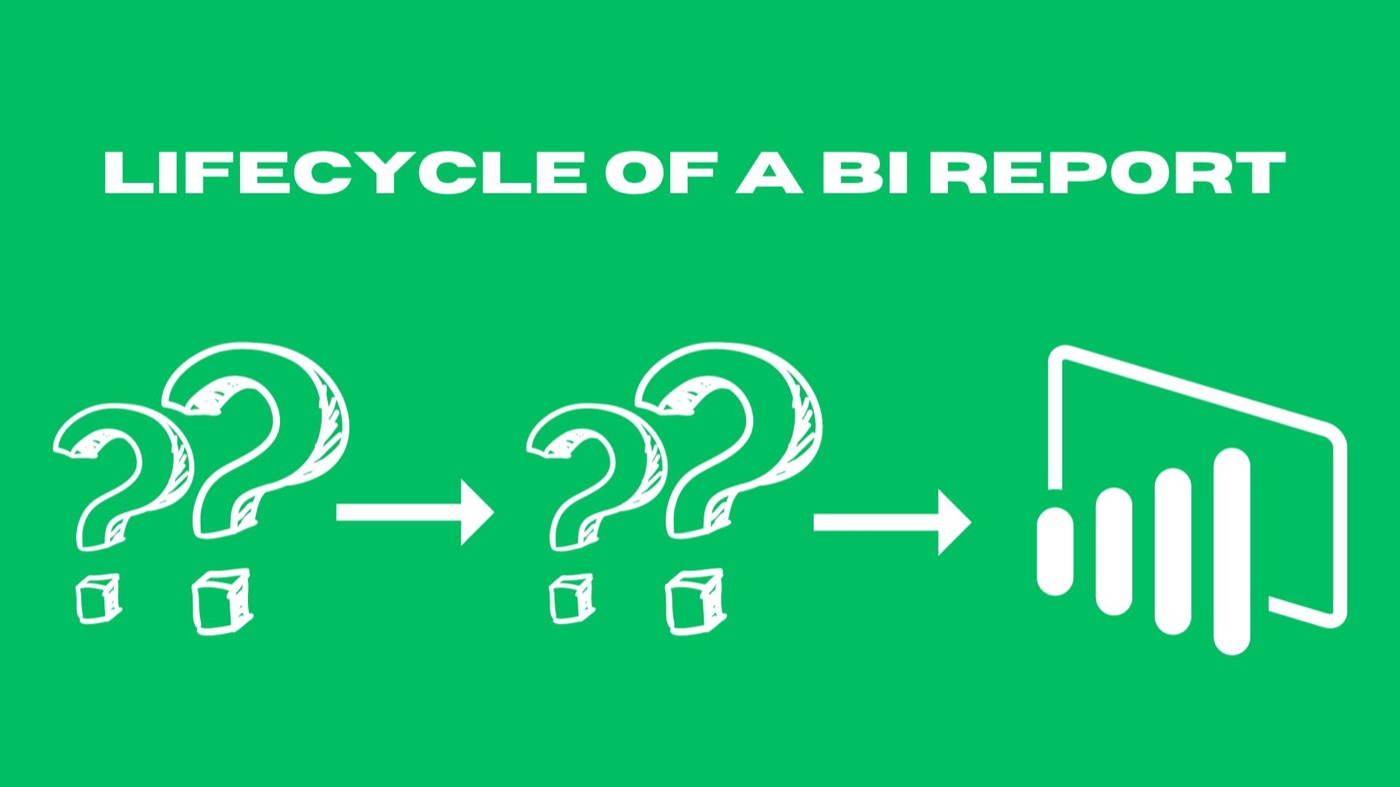 Sam, a savvy Business Analyst, embarks on a mission to craft a BI report. Through his adventure, we'll unravel the captivating lifecycle of a BI report.
169. Why Upskilling for Data Visualization Is Essential in 2023
 Businesses used to see data as a byproduct of their operations. Nowadays, they should see it as a valuable asset.
170. From Sustainable Agriculture to Programming - with Noonies Nominee Akis Loumpourdis
 I am Akis Loumpourdis, a 2021 Noonies Nominee. This is a small interview to get to know me a bit better.
171. Watch Out for Deceitful Data
 Nowadays, most assertions need to be backed with data, as such, it is not uncommon to encounter data that has been manipulated in some way to validate a story.
172. Top Data Analyst Skills in 2021
 Enhance your knowledge and skills in the field of data analytics with the help of data science certification for a rewarding career as a data analyst.
173. Tracking H1N1pdm09, the Hantavirus, and G4 EA H1N1 w/ Data Mining
![]() After the start of this whole Covid19 pandemic, worries of other viruses have been making rounds. These worries have ranged from variations of the Hantavirus showing up in China, to newly reoccurring worries of H1N1 strains. While people aren't too worried about widespread animal to human and human to human transmission, the same was thought about in regards to Covid19. While it is less likely these viruses are worth a concern, their data at least to some regard is worth exploring.
After the start of this whole Covid19 pandemic, worries of other viruses have been making rounds. These worries have ranged from variations of the Hantavirus showing up in China, to newly reoccurring worries of H1N1 strains. While people aren't too worried about widespread animal to human and human to human transmission, the same was thought about in regards to Covid19. While it is less likely these viruses are worth a concern, their data at least to some regard is worth exploring.
174. Calculating a Dynamic Truncated Mean in Power BI Using DAX: A Quick Guide
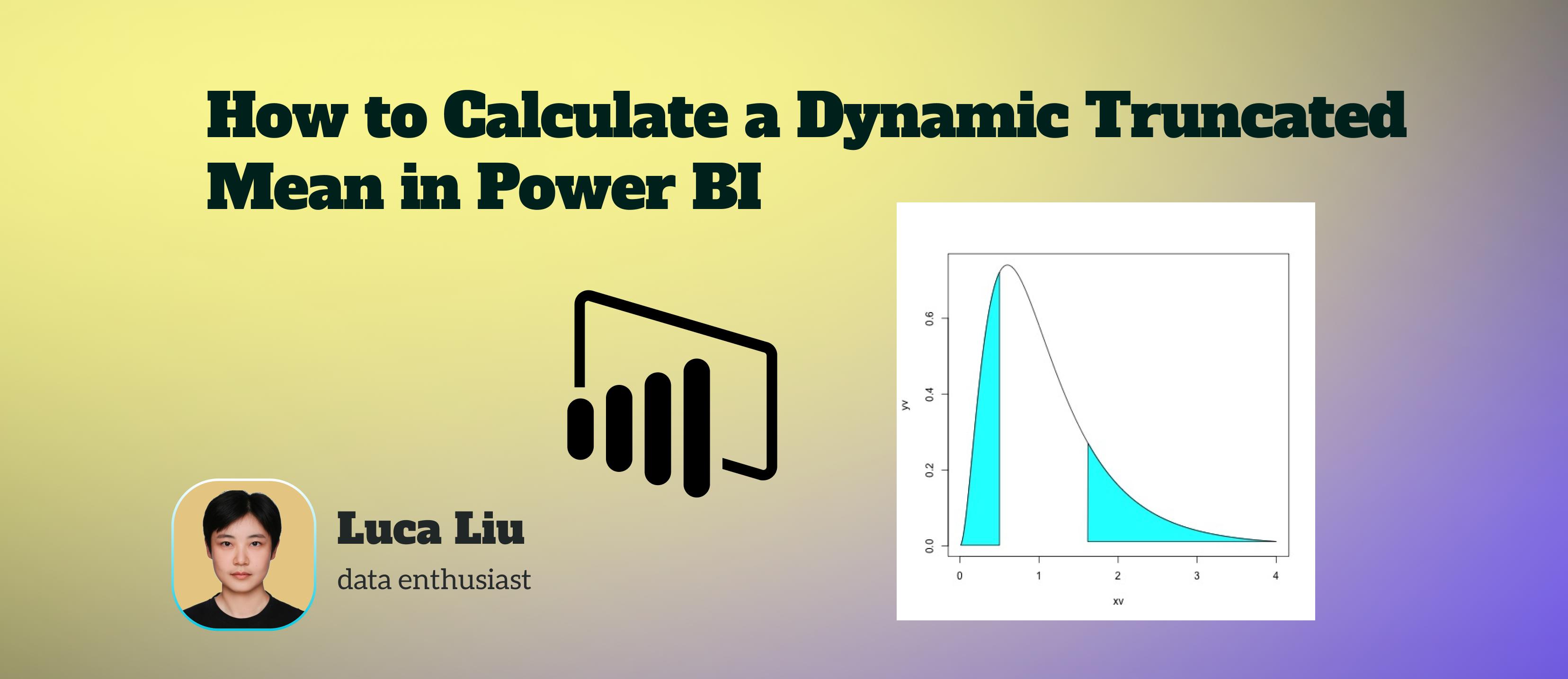 By implementing this DAX pattern, you create a robust, dynamic, and outlier-resistant KPI.
175. New Power BI Features For More Streamlined Data Analysis
 Here are the new features of Power BI (unveiled at the Microsoft Ignite 2021) that can be absolutely beneficial for business users.
176. Can Machine Learning Predict Loan Defaults?
 Visualize Insights and Discover Driving Features in Lending Credit Risk Model for Loan Defaults
177. 5 Benefits of Dashboard Software for Business Intelligence in 2024
 Discover how dashboard software revolutionizes businesses—enhancing efficiency, empowering decisions, and driving cost-effective insights in 2024.
178. Microsoft's Power BI for Business: Features, User Experience And Pricing
 All you need to know about Power BI Features, Benefits, Use Cases and pricing. A Comprehensive Guide to Power BI and how it stacks up to Microsoft Excel
179. Building the "Spotify Wrapped" of Product Hunt: A 48-Hour Technical Sprint to Map the Maker Economy
 I built a cinematic 'Spotify Wrapped' for Product Hunt makers using Next.js. Discover your 2025 global rank and persona before our Dec 27 launch!
180. Processes and New Technologies in Data Transformation
 In this article, I explore the benefits, types, and processes of data transformation and how it contributes to data management, integration, and new technologie
181. 8 Steps to Find the Best Reporting Component for Your Application
 Find the best reporting component for your app to enhance it with outstanding reporting functions. Answer 8 guiding questions to find a suitable solution.
182. How to Build a Data Stack from Scratch
 Overview of the modern data stack after interview 200+ data leaders. Decision Matrix for Benchmark (DW, ETL, Governance, Visualisation, Documentation, etc)
183. Visualize 1,000 Earnings Reactions—Fast
 Use FMP APIs to pull earnings, surprises, and price reactions across ~1,000 NASDAQ stocks—then tell the story with six trading visuals.
184. "Using this method, I went from a teller to an executive," says Carlo Martinez CEO of Steppingblocks
 How I became obsessed with helping students connect college degrees to careers sooner. So, I decided to build a platform and call it Steppingblocks.
185. Manticore Search Now Integrates With Grafana
 We are excited to announce that Manticore Search starting from 6.2.0 integrates effortlessly with Grafana.
186. How Government Agencies Flex Their Data Science Muscle

187. Is Shrinking Smart? A Beginner’s Guide to Dimensionality Reduction
 Discover how dimensionality reduction simplifies complex datasets and enhances machine learning performance. Learn key techniques like PCA, t-SNE, LDA, and auto
188. How to use paper.js to compare RC cars
 Compare radio controlled car dimensions with diagrams using paper.js.
189. Data Visualization Got Boring, So I Made DataGlass
 DataGlass is an AI-powered data visualization tool.
190. The Visual Framing of COVID-19 on Search Engines
 To collect the data, we used a novel algorithmic auditing approach based on large-scale simulation of user browsing behavior via virtual agents
191. Revolutionizing Data Management for Strategic Decision-Making
 With AI and ML creating new datasets that previously didn't exist, the challenge lies in continuously developing skills to visualize this data.
192. Native Analytics On Elasticsearch With Knowi
 Table of Contents
193. Managing the Spatial Data for My Wildfire Detection Dashboard
 A look at how I manage the spatial data for a wildfire detection dashboard that I previously built.
194. Data Virtualization: How It Works And What Benefits We Can Get From It
 In the healthcare sector, data virtualization (DV) is gaining traction. It's still a hot subject, with many leading industry experts hailing it as a game-changer.
195. Comprehensive Data Analysis with SQL and Data Visualization: Alibaba User’s Behavior Investigation
 This user behavior report is based on users’ orders from Alibaba between November 25th, 2017, and December 3rd, 2017 from the Alibaba platform...
196. How I Built an Options Monitoring Tool in Hours
 Learn how I built a real-time options monitoring tool with Python, Streamlit, and SpiderRock in hours instead of months.
197. What Led to Vizualizing the COVID-19 Pandemic: The The Theoretical Background
 In our chapter, we utilize the typology introduced by Semetko and Valkenburg (2000) to distinguish five types of generic news frames
198. How to Democratize Access to Data Insights for Businesses of All Sizes
 Messy government data has been part of the reason we've been unable to understand the COVID-19 pandemic. If federal organizations can't decode big data, what hope do small businesses have?
199. How to Use Tableau Visualization to Make a Covid Risk Model
 In this paper, I used data from two different data sources and merged them together in the Tableau layer to perform the data analysis.
200. The Noonification: HackerNoons Emoji Credibility Indicators are Live on GitHub and Figma! (4/16/2024)
 4/16/2024: Top 5 stories on the HackerNoon homepage!
201. Automating Data Analytics Workflows With AI to Improve Operational Efficiency
 How to supercharge data analytics workflows and build trust with metric layers, self service and AI-assisted analytics.
202. 6 Tips for Working With Analysts and Data Engineers
 What work does a data engineer actually do? Let me tell you one thing: it’s not what you think they should be doing, especially not the part where they are running around collecting data for you or building yet another one of those dashboards that will only be used for a few weeks.
203. This Is How the Covid-19 Pandemic Looks Like
 In today’s high-choice media environment, search engines play an integral role in informing individuals and societies about the latest events.
204. This Is What a Pandemic Looks Like: An Author's Note Before We Begin
 This is the preprint version of the "This is what pandemic looks like: Visual framing of COVID-19 on search engines" chapter.
205. Build a Command-Line Tool for Skyline Queries in Golang
 Learn how to implement skyline queries in Go using real datasets, CLI tools, and visualize skyline points from a CSV file—no backend needed.
206. Big Data: 70 Increíbles Fuentes de Datos Gratuitas que Debes Conocer para 2020
 Por favor clic el artículo original:http://www.octoparse.es/blog/70-fuentes-de-datos-gratuitas-en-2020
207. Impressions From Attending Live Kaggle Competition
 In early February I saw that a “March Madness” competition was being hosted on Kaggle. I thought this might be something I could do since I am somewhat interested in sports, but when I looked at the competition I was pleasantly surprised . . . there was an analytics portion. The Google Cloud & March Madness Competition had three portions this year: A Competition predicting the Men’s Tournament, the Women’s Tournament, and a separate analytics competition. I had been planning on working on my EDA and visualization skills anyway, so I thought this would be the perfect training ground.
208. Operator Performance Tuning: Building a GUI for Prometheus Metrics Visualization in Kubernetes
 An in-depth exploration of how I built a terminal-based dashboard to display Kubernetes operator Prometheus metrics for local development
209. How to Improve Social Media Campaign Using Data Visualization
 Learn what social media data visualization is and why it is important.
210. How Nutanix VM Works
 In the era of enterprise cloud, modern enterprise datacenter must support
virtualization with high availability and live VM migration. The traditional storage area networks (SAN) or network attached storage (NAS) doesn’t suit. Instead, they are ideal to manage a logical unit number (LUN). A LUN can be a single disk, an entire redundant array of independent disks (RAID), or disk partitions.
In the era of enterprise cloud, modern enterprise datacenter must support
virtualization with high availability and live VM migration. The traditional storage area networks (SAN) or network attached storage (NAS) doesn’t suit. Instead, they are ideal to manage a logical unit number (LUN). A LUN can be a single disk, an entire redundant array of independent disks (RAID), or disk partitions.
211. Where Visuals And Algorithms Collide: How Unrelated Algorithms Produce Intuitive Markings
 A nautilus seashell with a perfect spiral is the product of specific DNA that coded for its existence.
212. Using Data Science to Predict Effects of New UK Fishing Zonal Attachment Proposal
 The UK government is pushing for a “zonal attachment” model, where quotas would be carved up relative to the abundance of fish in each country’s waters.
213. Unveiling the Hidden Gems: A Journey into Exploratory Data Analysis (EDA)
 Master EDA to uncover data patterns, relationships, and anomalies. Learn cleaning, visualization, statistics, and hypothesis testing for powerful insights.
214. Syncing Data from Coda to Google Sheets And Vice Versa with Google Apps Script [A How-To Guide]
 Last year I published a tutorial on how to sync data between two Coda docs and data between two Google Sheets. What was missing from the tutorial was how to sync data between a Coda doc and a Google Sheet.
215. The World Population Crosses 8 Billion People
 A look at the growth trends of the world's 8 billion people and beyond.
216. How To Segment Shopify Customer Base with Google Sheets and Google Data Studio
 After defining what the RFM analysis is standing for, and how you can apply it to your Customer Base, I want to show you how to apply it on Shopify orders data.
217. Accessible Data Visualization in Fintech: Why It Matters
 Lessons from implementing WCAG 2.1 AA compliance in regulated financial software - data tables, chart contrast, focus management, and the institutional sales...
218. From "Bad Period" to #1 on Product Hunt: How I Built PH Wrapped in 24 Hours
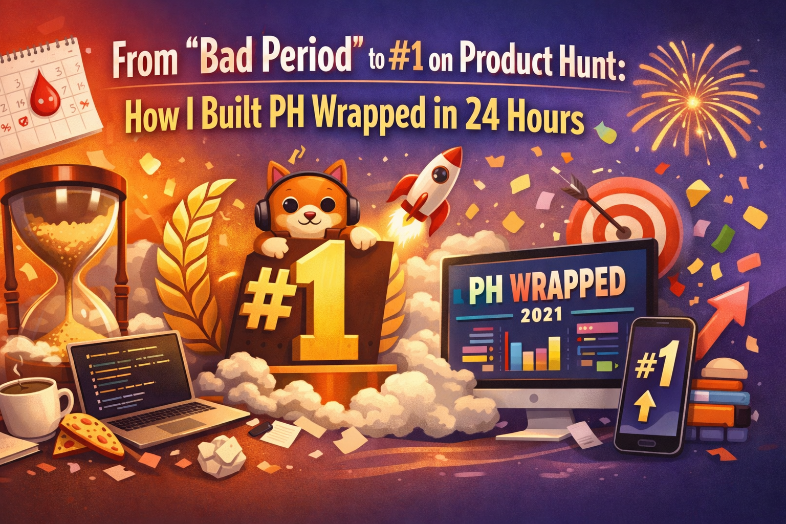 From "bad period" to #1 on Product Hunt: How I built PH Wrapped in 24 hours. A story of grit, 2025 maker stats, and why you should never stop shipping.
219. Everything You Need to Know About Deep Data Observability
 What's Deep Data Observability and how it's different from Shallow.
220. Optimize Power BI Reporting and Designing
 As a data analysis tool, Power BI comes loaded with plenty of report generation and design features. However, do not rely on the default settings of the tool.
221. The Three Basic Benefits of a Virtual Data Room
 The popularity of online virtual data rooms has increased over the years. These are innovative software used for safe storage and sharing of files. As the world is modernizing, people are using advanced technology to carry out their daily tasks. As everything today is digital, it becomes more and more crucial to look for new methods to store files. Gone are the days when people used to pile up hard copies of all the files in the offices. Some people are still seen doing that which wastes half of their time. Imagine you have a business meeting in some time and you can’t find a specific file because there is a huge unorganized bundle of files in your office. With virtual data rooms, all your files are well organized. You do not have to get into a hassle of finding a certain file. With just one click, the file appears in front of you in no time.
222. How To Choose The Right Business Intelligent Tool
 In this blog, we look at strategies for selecting the right BI tool as well as some important things to keep in mind throughout the process.
223. Which Profession Does Society Celebrate the Most? A Data-Driven Dive into Madame Tussauds
 Unveiling the most celebrated professions: Explore Madame Tussauds' wax figures and discover societal preferences. An intriguing data-driven analysis.
224. Bits and Bytes and Data Delights
 Limarc Ambalina, Ellen Stevens, and Amy Tom chat about data privacy ☠️ Humans are in loooove with the internet, and data production is becoming more rampant and
225. Displacement of Low-Income Minorities in San Francisco
 San Francisco’s housing crisis perpetuates the poverty trap faced by low income minorities in the city.
226. How Public Data and Statistical Modeling Can Help Shape Smarter Urban Policy
 Open data can drive better policy when combined with robust statistical modeling.
227. 5 Most Common Data Quality Issues For Business
 With the advent of data socialization and data democratization, many organizations organize, share and make information available to all employees in an efficient manner. While most organizations benefit from liberal use of such a source of information available to their employees, others struggle with the quality of the data they use.
228. Noonies Interview: Luke Calton On Product Management and Writing
 Luke Calton is Noonies Nominee and a Product Manager at a start-up.
Thank you for checking out the 228 most read blog posts about Data Visualization on HackerNoon.
Visit the /Learn Repo to find the most read blog posts about any technology.